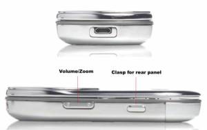
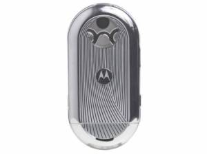
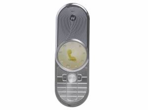
At the rear of the handset a transparent casing reveals three tungsten-carbide coated gears that assist in the handset’s panel rotation. The 2 megapixel camera’s lens is also plainly visible. You can see the gears in action while rotating the panel. A micro USB all-in-one port is located at the top of the handset.
Features and Performance
I imagined the Aura basking in the glory of that blinding price tag to have features that would rival any phone anyone could come up with. However, at the crux of it, the Aura is just a fancy phone that’s designed with a very unique blend of materials, as mentioned, a sophisticated look and feel and one of THE most brilliant displays I’ve ever seen. Underneath that stainless steel exterior is a pretty standard Motorola handset with very, very standard features.
I imagined the Aura basking in the glory of that blinding price tag to have features that would rival any phone anyone could come up with. However, at the crux of it, the Aura is just a fancy phone that’s designed with a very unique blend of materials, as mentioned, a sophisticated look and feel and one of THE most brilliant displays I’ve ever seen. Underneath that stainless steel exterior is a pretty standard Motorola handset with very, very standard features.
Interface
Although the UI has been designed to suite the round display it’s horribly sluggish most of the time. Multitasking is a b*t*h. With the audio player on in the back ground typing a simple message became a cumbersome task. Even with Motorola’s auto-complete feature, which is quite remarkable as is, I had already hit keys worth three full words before I had to stop and wait for the phone to catch up. Without anything running in the background, I was able to stay at least one and half word ahead of the handset.
The interface is simple though and not all that jazzy. The main menu system has simple icons and the sub menus are just the names of features that scroll up or down. The desktop uses specifically designed wall papers or simply expands an image from the photo gallery to suite the round display by cutting out the edges and centering on the middle of the picture. It manages to do this quite well, just make sure that the picture has enough space around the subject you wish the focus to be on.


